CSS only: SVG Wave Animation
This is a quick SVG and CSS wave animation blog. I have also created video of creating the same.
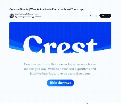
Here, a single wave is animated. Animations like these are super common and used in multiple places on websites — like you might’ve seen them in the bottom footer or header.
I’ve seen it many, many times. Knowing this technique unlocks the potential to generate varied effects.
For example, here — you can see there’s a transparent layer behind this colored layer, and both of them are moving in different ways.

So there are two different waves, right? And if you know how to create wave animations, you can easily build stuff like this.
See this one? It’s also super simple and really effective. There are three different waves moving at three different times, one after the other — clean and smooth.
Here, I’m going to show you a simple SVG wave animation setup.
I’ve created two different SVG waves, and I’m just showcasing them here to explain how this works.
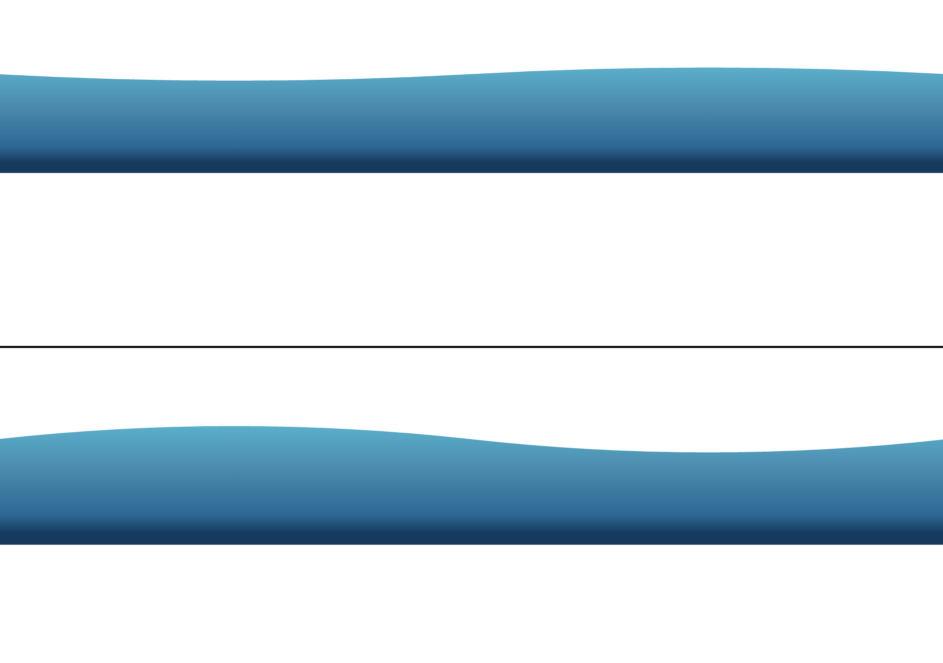
So, as you can see, this is the first wave — it has a high bump on the right side. And this is the second wave — the high bump is on the left side.
When we alternate between these two SVG paths, we get this nice wave animation. This helps us create a feeling of motion. Now, just to explain how these individual waves work, I created two separate SVGs, but all you need is one SVG and two paths.
How to Create SVG Waves
You can create SVG waves using any tool you like — Figma, Illustrator, or even by writing SVG code by hand (if you’re into that sort of thing!).
For simple shapes like waves, hand-coding is actually quite doable.
But there’s an even easier way…
You can search online for “SVG wave generator.”
There are plenty of tools out there — and most of them let you:
- Adjust the number of bumps
- Flip or rotate the wave
- Change colors, opacity, and more
One such tool is https://getwaves.io
Once you’re happy with the shape, you can copy the generated SVG code.
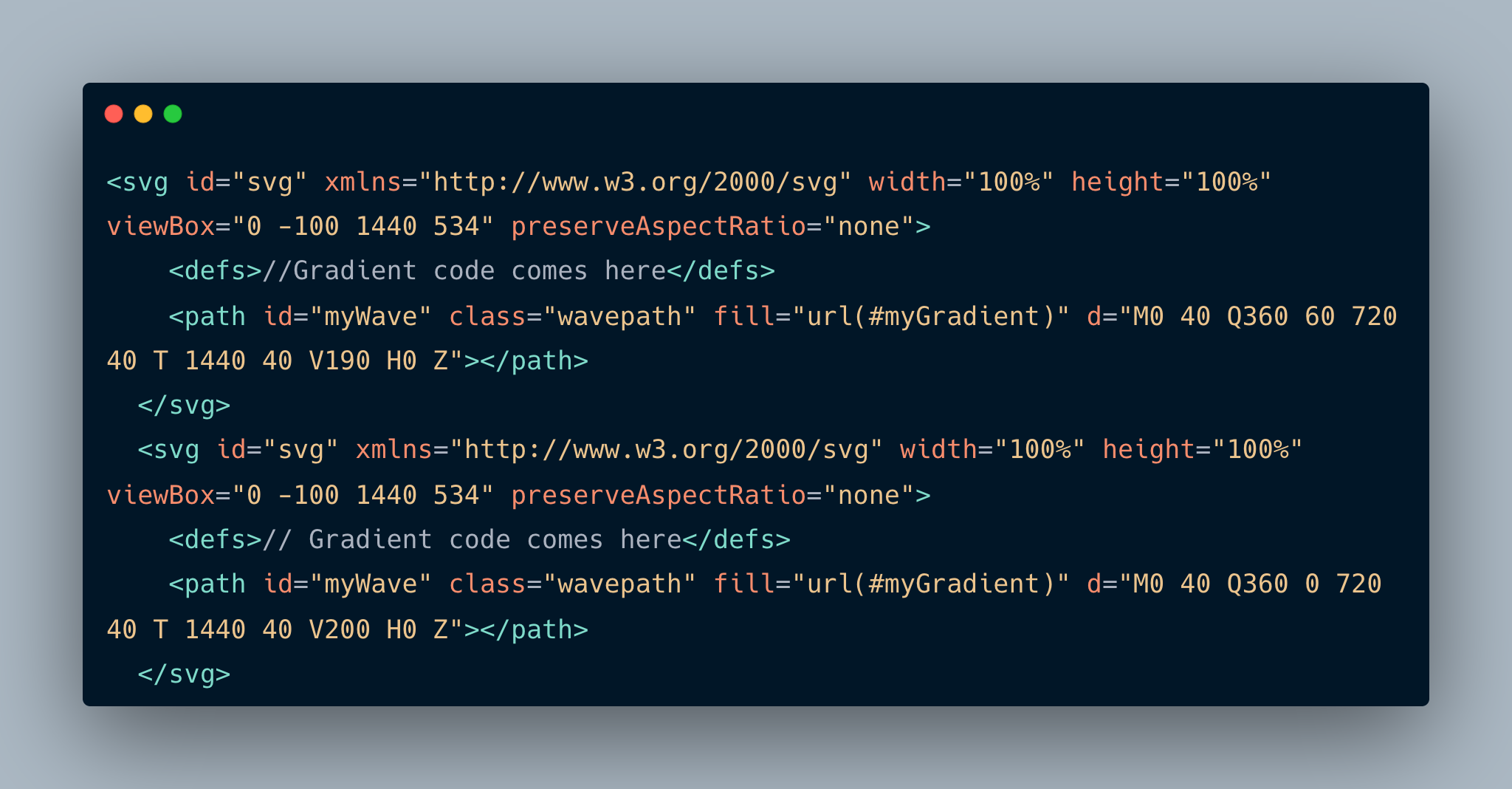
You’ll get a SVG with viewBox, and inside it, the path element — and that’s where the magic happens.
Key Things to Keep in Mind
To animate a wave like this, you need two SVG paths — basically, two different shapes that transition from one to the other.
Make sure both SVGs use the same viewBox. That’s very important — otherwise, the animation will look jumpy or broken.
Here’s how it works:
Each SVG path has a d attribute — this is a set of coordinates and curve commands that define the shape.
When animating, we basically change the d value over time — from the first path to the second — using keyframes.
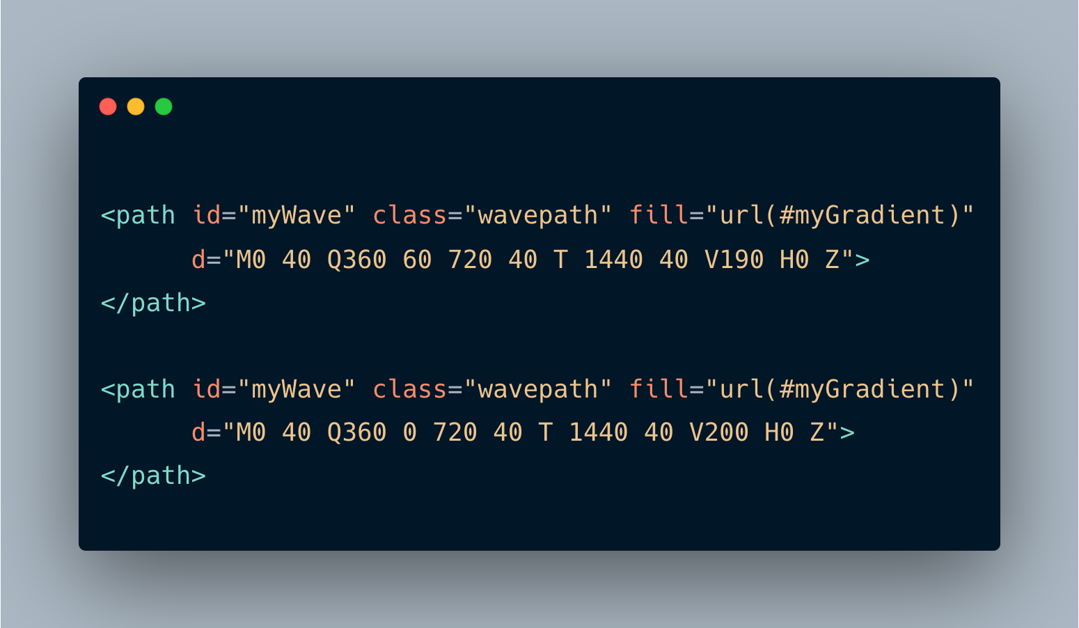
In my case, I didn’t create these paths from scratch. I found an existing one and just edited the bump position manually in the second version. The only things that change between the d attributes are V190 and V200, if you see the image. Changing that value gave me two different waves.
The Animation Part
We animate the d attribute using CSS.All you need is a keyframe animation that transitions between the two path values. You can set the animation to:
- run infinitely
- alternate back and forth
- and use
ease-in-outfor smoothness
And that’s it — your wave animation is ready!
#svg path {
	animation: wave 0.8s ease-in-out infinite alternate;
	d: path("M0 40 Q360 0 720 40 T 1440 40 V200 H0 Z");
}

@keyframes wave {
	100% {
		d: path("M0 40 Q360 60 720 40 T 1440 40 V190 H0 Z");
	}
}
Bonus Tips
Want to make it look even cooler?
- Add a second wave layer in the background
- Give it a different color or opacity
- Maybe blur it a little or offset its position
This gives you a nice layered wave effect.
You can also clip the wave inside a shape — like a circle — and animate it horizontally.
This technique is often used in web design to create stylish section dividers or loaders.
Since it’s SVG, the animation stays sharp and works great on all screen sizes — just keep your viewBox consistent across all wave paths.
And if you want to reposition waves or layers, you can just tweak the x & y position in viewbox or use transform in path.
So yeah — that’s a simple and fun way to animate SVG waves using just two paths and a bit of CSS!