SVG TIP: Why Transforms Don’t Work as Expected inside SVG (And How to Fix It)
I made a video explaining this issue—check it out!
When animating SVGs, you might notice that rotations and other transforms don’t behave as you’d expect. For example:
You apply a rotation, but instead of spinning in place, the element moves around unpredictably.
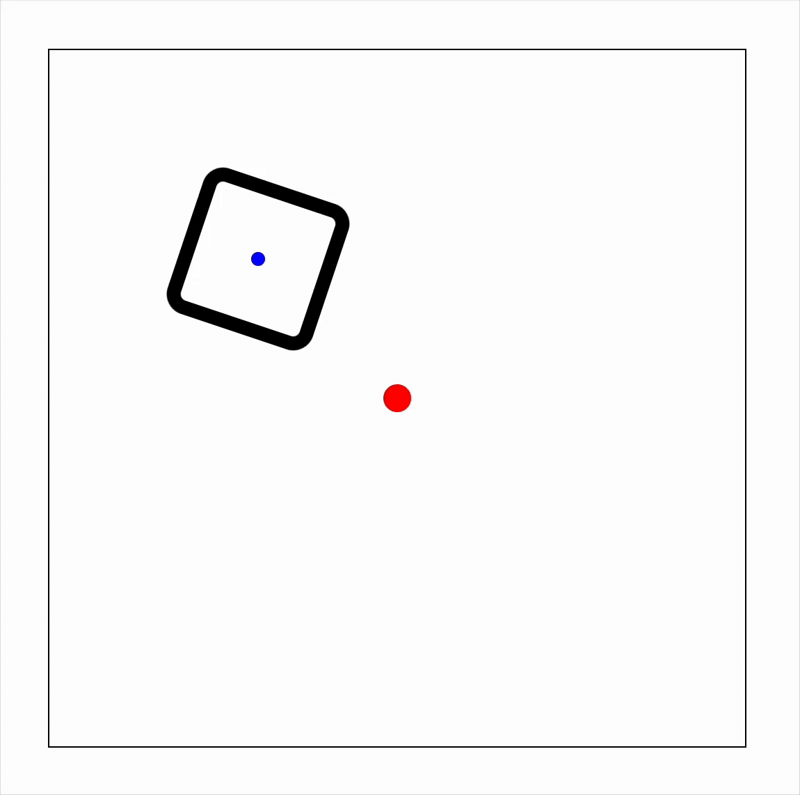
Demo: Rotating a Square Around Its Center
Here’s an example:
-
A outermost square (thin black outline) is SVG outline.
-
A square (thick black outline) with a blue circle at its center.
-
We want the square to rotate around the blue circle.
-
The red circle marks the SVG’s center (not the square’s center).
First Try: Basic Rotation
#box {
	animation: rotateBox 3s linear infinite;
}
@keyframes rotateBox {
	to {
		transform: rotate(360deg);
	}
}
Problem: The square rotates around the top-left corner (default transform-origin) of the SVG.
Second try: Set the transform-origin to 50% 50%.
#box {
	animation: rotateBox 3s linear infinite;
	transform-origin: 50% 50%;
}
Still a problem: Now it rotates around the SVG’s center (red circle), not the square’s center.
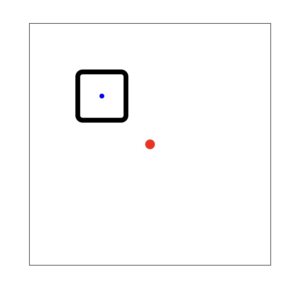
The Fix: transform-box: fill-box
#box {
	animation: rotateBox 3s linear infinite;
	transform-origin: 50% 50%;
	transform-box: fill-box; /* Makes transforms use the element's own origin */
}
✅ Now it works! The square rotates around its own center (blue circle).
Why This Happens
By default, SVG transforms use the SVG’s coordinate system, not the element’s. The issue is resolved by using transform-box: fill-box, which makes transformations relative to the element.
🔗 Live Demo: CodePen Example
See the Pen Demo Transaform box by trapti (@tripti1410) on CodePen.
Important points
- Default transform-origin in SVGs can be tricky.
- Use
transform-box: fill-boxto make transforms behave as expected inside the SVG.
This small CSS tweak saves a lot of frustration!